Color is often the first thing you notice about an outfit, even before you notice the individual clothes.
A navy sweater with stone chinos looks naturally coordinated. Replace the chinos with a very bright orange pair and suddenly color becomes the main event. That doesn’t necessarily make the outfit wrong—it simply changes how much attention the colors demand.
Learning how to match colors in an outfit isn’t really about memorizing a color wheel. It’s about knowing which colors are easy to combine, how much contrast you want, and when one color should be allowed to do most of the work.
Once you understand a few reliable combinations, color matching becomes much less complicated.
Start With the Color You Can’t Change
Here’s the approach I find most useful: don’t try to coordinate the entire outfit simultaneously.
Start with one piece.
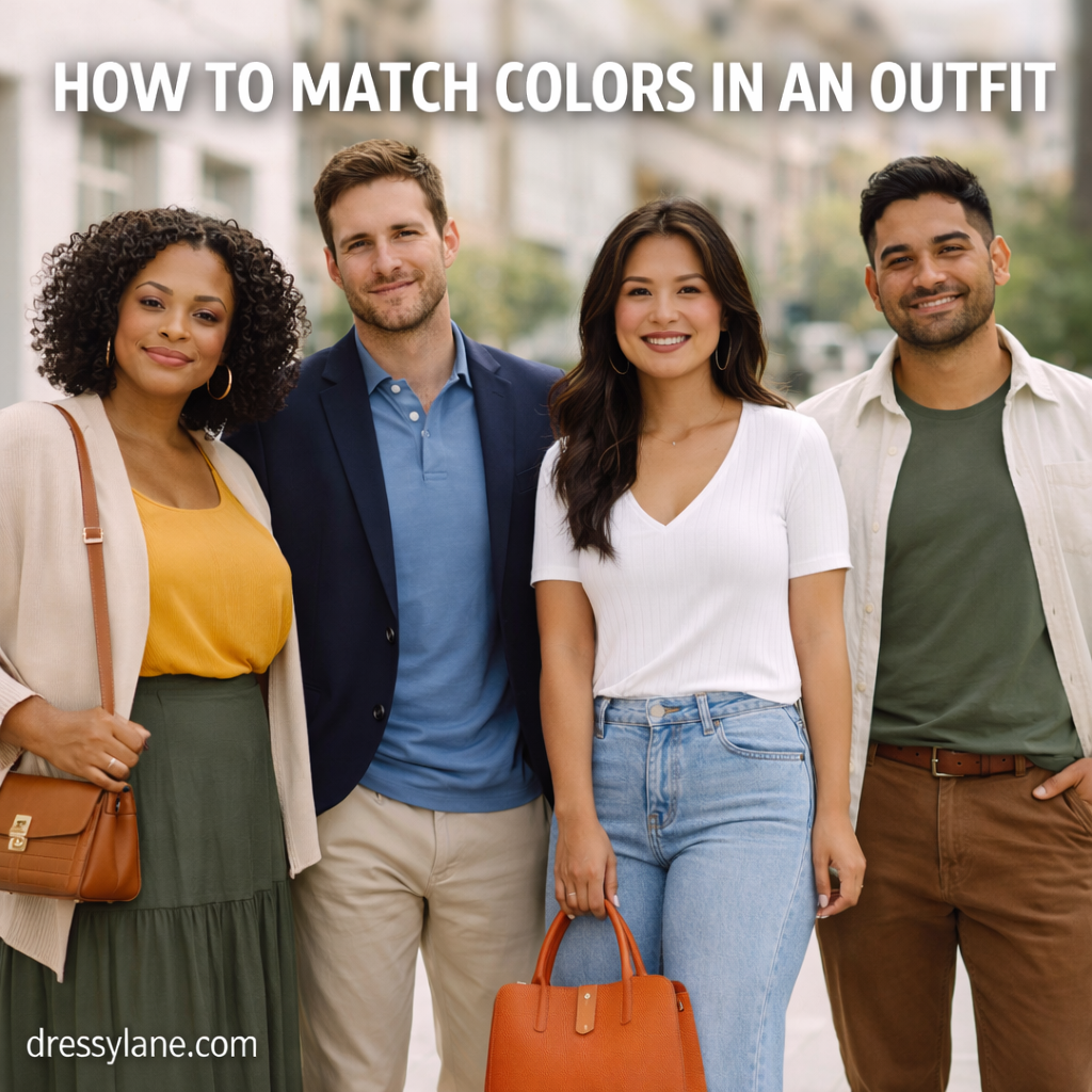
If you’re wearing olive trousers, those become your starting point. You might add a cream shirt and brown shoes. If you’ve chosen a burgundy sweater, try it with charcoal trousers and black or dark-brown shoes.
This is particularly helpful when the starting piece is colorful.
Instead of asking, “What colors should my outfit be?” you’re asking a much easier question: What works with this green shirt?
Learn Your Neutrals First
Black, white, cream, gray, navy, beige, camel, brown, olive, and denim are useful because they can anchor stronger colors.
And no, your neutrals don’t all have to match.
A navy jacket can work with gray trousers. Cream can work with camel. Brown shoes can work with blue jeans. Black can be worn with beige.
I’d actually avoid trying to match neutral colors too precisely. Wearing shoes, trousers, a belt, and a jacket in four slightly different versions of the same brown can sometimes look less intentional than deliberately combining brown with cream, navy, or olive.
Denim is especially useful because medium and dark blue jeans function almost like a neutral. A white shirt, burgundy sweater, olive jacket, gray T-shirt, or rust-colored knit can all work with the same pair.
Use Contrast to Control How Bold an Outfit Feels
Color combinations usually become more noticeable as the contrast increases.
Black and white create strong contrast. Navy and cream do too, although the effect is softer.
Gray with dusty blue, camel with cream, or olive with brown creates much less contrast and tends to feel quieter.
Neither approach is better.
If you want a simple work outfit, charcoal trousers with a pale-blue shirt may be exactly right. If you want something more noticeable, those same charcoal trousers could work with a deep burgundy knit.
Think about contrast as a dial rather than a rule.
You Don’t Actually Need a Three-Color Rule
The common advice to wear no more than three colors can be helpful when you’re learning, but I wouldn’t treat it as a fashion law.
An outfit might include navy trousers, a white shirt, brown shoes, a burgundy tie, and a gray coat and still look completely coherent.
What matters is the visual weight of those colors.
A brown belt or small gold earring doesn’t necessarily count the same way as a bright yellow jacket.
Instead of counting every color, ask whether several colors are competing for attention. If the answer is yes, remove or quiet one of them.
One Strong Color Is the Easiest Place to Start
If you’re uncomfortable combining colors, choose one noticeable color and surround it with quieter ones.
For example:
- Burgundy sweater + charcoal trousers + black shoes
- Cobalt blouse + dark jeans + tan loafers
- Forest-green dress + brown sandals
- Rust shirt + cream trousers + brown shoes
- Red knit + navy trousers + neutral sneakers
This works because there’s an obvious hierarchy. One color gets your attention; the others support it.
It’s also why I’d usually introduce a new color through a shirt, sweater, or accessory before buying bright trousers. Tops are generally easier to combine with neutral bottoms you already own.
Tonal Dressing Is an Easy Way to Look Coordinated
You can also build an outfit from different versions of the same general color family.
Light blue with navy is the obvious example.
Cream, camel, and chocolate brown can create a warm tonal outfit. Gray can move from pale heather through charcoal. Olive can be paired with lighter sage or deeper forest green.
The colors don’t need to match exactly—in fact, I’d rather they didn’t.
Slight differences in shade and texture create depth. A cream cotton shirt with camel wool trousers and a chocolate suede shoe is more interesting than trying to make all three pieces precisely beige.
How Women Can Combine Colors
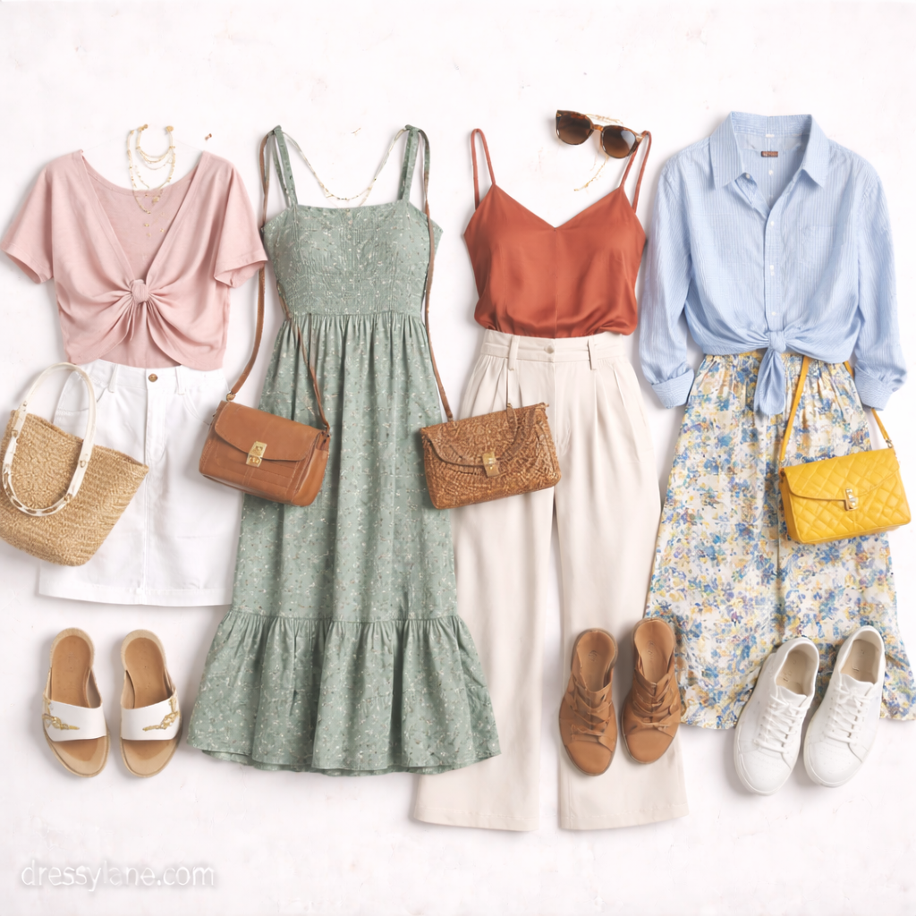
For women, shoes, bags, jewelry, and layering pieces create plenty of opportunities to add color without rebuilding the entire outfit.
An easy everyday combination is dark straight-leg jeans, a cream knit, and a burgundy or forest-green bag. For work, try navy trousers with a pale-blue blouse and camel loafers.
Other combinations worth trying include:
- Olive trousers + white shirt + tan shoes
- Burgundy midi skirt + cream sweater + brown boots
- Camel trousers + black knit + black loafers
- Dark denim + soft pink shirt + gray cardigan
- Navy dress + cognac or tan accessories
I wouldn’t worry about making the handbag and shoes match exactly. A dark-brown bag can work perfectly well with tan shoes if the overall palette makes sense.
Metallics can also behave like neutrals in small amounts. Gold jewelry tends to sit naturally with cream, camel, olive, brown, and many warm colors, while silver works easily with gray, black, navy, blue, and cooler shades—but these are combinations, not restrictions.
How Men Can Combine Colors
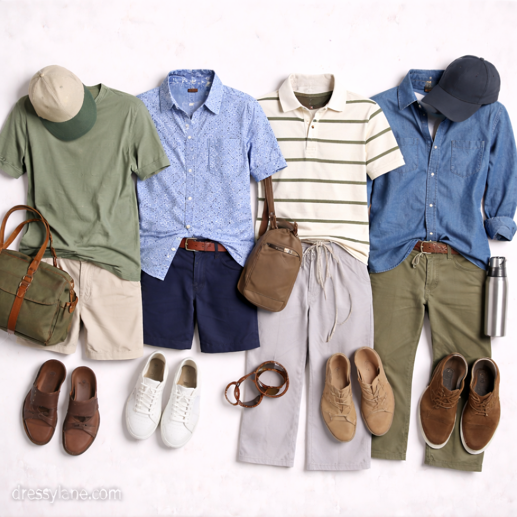
Men can build a large number of outfits around navy, gray, brown, olive, white, and light blue before introducing anything brighter.
A light-blue Oxford shirt with navy chinos and brown loafers is difficult to get wrong. So is a gray merino sweater with dark denim and brown boots.
From there, add richer colors:
- Burgundy sweater + gray trousers
- Olive chinos + cream polo
- Rust overshirt + white T-shirt + dark jeans
- Forest-green knit + tan chinos
- Navy blazer + pale-blue shirt + gray trousers
One menswear habit I’d be careful with is trying too hard to match the belt, watch strap, and shoes perfectly.
Keeping brown leather accessories in a similar general family is usually enough. They don’t need to look like they were cut from the same piece of leather.
Warm and Cool Colors Can Absolutely Be Worn Together
The idea that warm and cool colors shouldn’t mix is too restrictive.
Navy and camel work beautifully together. So do blue and brown, burgundy and gray, or olive and pale blue.
What can make an outfit feel awkward is having several highly saturated colors fighting for attention.
A bright orange shirt, vivid blue trousers, and intense green shoes require much more deliberate styling than a rust sweater, navy trousers, and brown shoes.
If you’re unsure, lower the saturation of one or more colors rather than worrying about whether they’re technically warm or cool.
Patterns Are Easier When You Borrow a Color From Them
Patterns don’t need an entirely different set of color rules.
Suppose you’re wearing a plaid shirt containing navy, cream, and burgundy. Navy trousers work because you’re repeating a color that’s already present in the shirt.
The same technique works with striped shirts, floral dresses, scarves, and patterned skirts.
Pick one of the quieter colors inside the pattern and repeat it elsewhere.
I’d avoid adding another unrelated pattern or strong color until you’re comfortable with the first one. Let the pattern provide the complexity.
Seasonal Colors Are Options, Not Rules
Burgundy, rust, camel, mustard, and forest green naturally feel at home in fall because they pair well with heavier textures such as wool, suede, corduroy, and denim.
Spring and summer often bring lighter combinations: cream with pale blue, white with olive, linen beige with soft pink, or light denim with almost anything.
But you don’t need to reorganize your entire palette every season.
Navy works year-round. So do white, black, denim, gray, olive, and many shades of brown.
Often it’s the fabric, not just the color, that makes something feel seasonal. A burgundy linen shirt and a burgundy wool sweater communicate very different things.
When a Color Combination Feels Wrong
Before deciding two colors “clash,” try changing the proportion.
Maybe bright red trousers with a blue shirt feel like too much, but a navy outfit with a small red bag looks excellent.
Or perhaps olive and purple seem difficult until the purple becomes a muted plum sweater paired with olive trousers and brown shoes.
This is why I’d take a quick photo of an outfit when you’re unsure. Seeing the whole silhouette on a screen makes competing colors surprisingly easy to spot.
You can then ask a simple question: Where does my eye go first?
If the answer is “everywhere,” simplify one element.
Final Thoughts
Learning how to match colors in an outfit doesn’t require memorizing dozens of approved combinations.
Start with one piece, anchor stronger colors with neutrals, and pay attention to contrast and proportion. Navy, gray, cream, brown, denim, olive, black, and white give you an enormous foundation to work from.
Then experiment.
Try burgundy with charcoal. Olive with cream. Camel with navy. Rust with denim. Pale blue with brown.
Some combinations will become personal favorites, and that’s ultimately more useful than following a universal chart.
The goal isn’t to make every color match perfectly. It’s to make the colors look like they were chosen to be worn together.